2021
In cloaboration with a the SAFR together team the job at hand was to create a illustrative design of some sort that would represent the cause of making covid testing and vaccinations more accesible and safer within the community to the targeted client which is the public. I started off by brainstorming the various ways I would be able to visually represent the SAFR together cause and the community of San Francisco, so I did some research and I conclude that my ideas should be revolving around the community itself which affiliates with the residents, people of the SF. Things such as birds that represent the windy piers, flowers that our parks shine with and the people who provide aid to one another within their community.

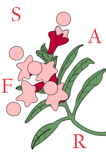
For this first design the intent was to emphasize the details in our natural growth individually and among our families and communities. The best way I found to illustratively symbolize my idea was to use nature, which portrays natural growth from the dirt, perfectly portraying the concept of our day to day lives in the midst of the pandemic. The design is a simplistic drawing of a plant that has leaf's pocking out of the stem along with flowers, the balls on top of the flowers represent heads of people and the flower as the bodies, SAFR is in small lettering scattered through ought the background, a noticible component to the visuals.


In this design idea the focus of the illustration was the effects on a large scale in accordance to our actions. key factors that stand out within this concept for me was the people, community, world, and the virus itself. With the pieces on the table I was able to narrow down a specific layout to the art. In the final design we have two figures of people of different color to show diversity all around the globe which are tied together at the bottom to represent our efforts as a whole to curing and stopping the virus from spreading and harming. Then the globe itself follows up, showing a majority of the surface land and almost all the continents (not all could fit) with different colors to distinguish both large landmasses and interconnect the common color for viruses (which is green) for better visual understanding that the virus is everywhere and it is everybody's problem. Finally SAFR is formatted on top to show the noticible organization for recognition.


